
The Audacity of Taupe
When Neutral Goes Too Far
Look, I don’t hate taupe, okay? I don’t hate very many colors. I’m a designer. I like color. All color. Even taupe has its moment.
But here’s the thing: taupe should not be the main character of your design story. It’s the best friend, the sidekick, the person who holds your purse while you dance. It is not (I repeat, NOT) the one leading the conga line.1
A Confession
When I was 15, my mom sold our family home and bought a beautiful condo that was still under construction. Three bedrooms, three-and-a-half baths. We each got our own space, our own bathroom. It was going to be great.
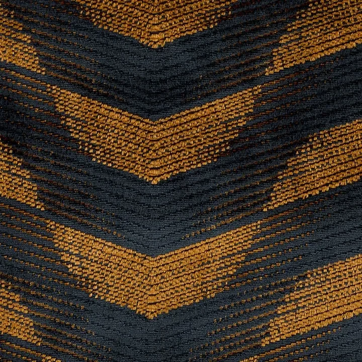
She even said I could have input on my bedroom design. Input, she said. So we went to her interior designer’s office, looked at fabrics, and I chose this gorgeous taupe paisley. See? I don’t hate taupe. This fabric had movement, pattern, interest. It was beautiful. She had Roman shades made from it, a bedspread, the whole deal.
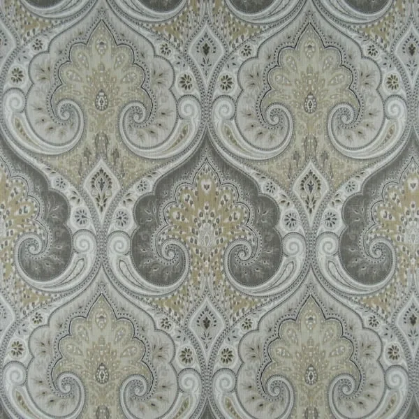
This Kravet fabric is the closest I could come to the mid-90s paisley I mentioned above.
And then that was it. That was all I got to choose.
Because conservative Latina Catholic moms, amirite?2
But here’s what I learned: those colors were actually great. Gray-blue? Gorgeous. Taupe paisley? Still beautiful. As long as they have pattern and texture, they can still say, “A human with feelings lives here.”3
The Real Issue With Taupe
Taupe has this relaxing quality to it. It’s easy. It goes with everything4. There are legitimate reasons to use neutrals in design.
It’s just not what I go to first.
Because taupe doesn’t show personality. It whispers when I want it to sing. For me, the bright, fun fabrics and patterns need to be the stars, the big furniture pieces, the bold artwork, the statement wall color, the wallpaper that makes people stop and stare. Those are the pieces that create an emotional reaction and tell your story.
Neutrals? They’re the supporting cast. They tone things down, they complement, they give your eye a place to rest. But they should never be the first thing people see or think of when they walk into your space. At least not when I’m in charge.
When Taupe Takes Over
I see it all the time: homes where taupe is literally everywhere. Taupe walls, taupe furniture, taupe throw pillows desperately trying to accessorize the taupe couch they’re sitting on. It’s like design purgatory, not quite beige, not quite gray, just hovering somewhere in the middle feeling very pleased with itself for being “safe.”
And look, if you genuinely love neutral color palettes and want a simple, toned-down space? That’s totally fine. It’s your home. You do you.
But if you’re hiring me, do it because you want me to pull an additional thread out of your story. You want me to find that part of you that’s a little more interesting, a little more personal, a little more bold, a little more unafraid. Because even if you think you want all neutrals, we’re going to need that fantastic accent pillow or that big piece of art with bright pink in it or that sculptural lamp that makes people ask questions.
We need something that creates a reaction.
If I ever design a room like this, somebody kill me. And see what I mean about that one pillow trying to lift the entire design? Don’t even get me started on the sad bench. Smh.
What I Do Instead
When I design with neutrals (and I do! I use taupe!), I make them work harder. I layer texture like my life depends on it: rough with smooth, matte with glossy, vintage with modern. I add pattern, paisley, stripes, geometric prints, something that provides the eye with interest. I use taupe as the accent, not the anchor.
The vibrant pieces? Those come first. That emerald velvet chair. That wallpaper with the bold botanical print. That deep navy accent wall that’s almost black but still holds a conversation. Those are the pieces that make you stop and smile when you walk into a room.
The taupe just makes sure everything else looks even better.

The Bottom Line
Your space should tell your story. Not the story of some imaginary future buyer who apparently has the emotional range of wet cement. The best stories don’t play it safe. And that’s why you have a designer, anyway. We’re here to make sure you don’t spend a huge chunk of your budget on something that won’t look good.
So by all means, use taupe. Use it with a gorgeous paisley pattern. Use it to ground a room that’s otherwise bursting with color. Use it as the breath between the bold moments.
Just don’t let it be the only thing people remember about your space.
Because you deserve better than that. You deserve a home that feels adventurous, interesting, and definitely not afraid to make people feel something.
What’s your relationship with taupe? Are you team “taupe is life” or team “taupe is the enemy”? Hit reply and tell me your story. I promise not to judge. Much.
I recently launched a series of luxury, educational wine tours. The first one kicks off in September. Sound interesting? Click the button below.
1 That would be Gloria Estefan. Everybody knows that.
2 She also took my beautiful oak furniture from our old house, this rich, deep, gorgeously stained wood, and had it painted gray-blue with black speckle. I was devastated. Like, legitimately heartbroken. I could tell she felt bad because she offered to have it redone, but I didn’t make her. Teenage martyrdom and all that.
3 As an Enneagram 4 teenage boy, let me just tell you, there were some feelings.
4 So does hot pink, but maybe that’s just in my own head.