
Statement Spaces, Hold the Migraine
Editing color and pattern to conquer chaos.

Alvéoles Fabric in Bouton D’Or by Karin Sajo
Yesterday, LDA (Levi, Design Assistant) and I were swimming in samples for Elliano clients. Karin Sajo fabrics, Wolf Gordon wall coverings, Holly Hunt chandeliers. And I found myself in that familiar dance:
Bold, but not bonkers.
Vibrant, but not Vegas.
Colorful, but don’t make the neighbors call an exorcist.
It’s a line I walk in almost every project.
Just last week, I showed Claid a set of bold patterns I love and explained how I pair them with clean, structured lines. Yes, I want multi-color tapestry. But I also want it sitting next to a Scandinavian dining table.
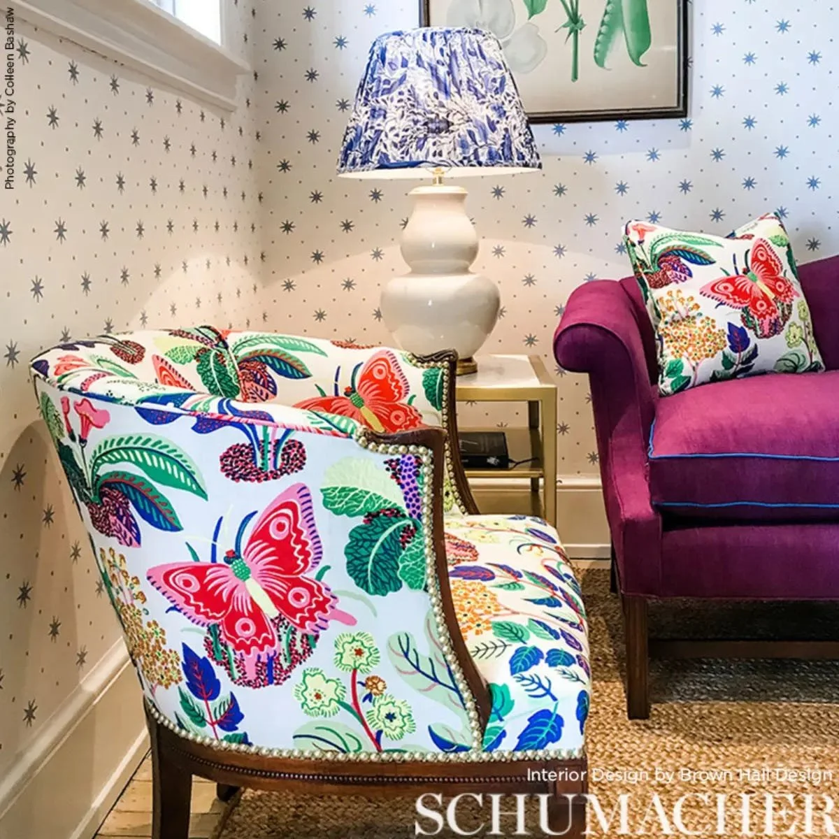
Because here’s the thing: “bold design” can mean many things. Maximalism gets a bad rap for being messy, and for good reason. Left unchecked, it can look like your house swallowed an estate sale whole and then chased it with an entire flea market. But when you know where to stop? That’s when you turn the screech of a barn owl into sweet, sweet music.
The Secret Sauce: Contrast and Control
Conquering the madness is all about contrast. Want a big, bossy pattern on the curtains? Great. Let the sofa be a solid. Got a wall of bold wallpaper? Keep the trim crisp and the floor grounded.


Simple Kravet white pattern with solid blue gray pattern
While LDA and I were prepping a colorful fabric landscape for a client, something in my gut told me it wasn’t quite right. Beautiful, yes, but not grounded. It wasn’t chaos, but it was teetering on the edge. Then we took out one small pattern and replaced it with a solid, and suddenly the whole thing clicked.
Think of it like hosting a dinner party: if everyone talks at once, it’s like a toddler with a tambourine. But if one guest tells a great story while the rest listen, it’s captivating. The same is true in design. Something has to take the lead while everything else supports it.
Color: Loud, But Limited

Sometimes a girl just needs Schumacher in a bright pink.
Yes, I love teal. Yes, I love chartreuse. Yes, I love teal. Yes, I love fuchsia. Yes, I love teal. (You get the idea.)
But I don’t use all five three together just because I can. I pick a palette, usually 2–3 strong colors, and let them have their moment. Then I sprinkle in neutrals (navy, charcoal, or deep olive NOT beige) so the eye gets a breather.
What to avoid is pulling back too far. A lot of folks would use the bold pattern on a throw pillow. That’s a cop out. I see you and I am disappointed in you.
Take that beautiful fabric and put it on a side chair. Or an ottoman. Or the large sectional. If your colors are Blush and Bashful, don’t hide from them. Make the statement and make it loudly.
Patterns Need Space to Breathe
I have a deep love affair with bold patterns, but they shine brightest when they’re not fighting for attention. That’s why I’ll pair a dramatic rug with clean-lined furniture or a geometric wallpaper with simple cabinetry. The tension between busy and calm is what makes the boldness feel intentional.
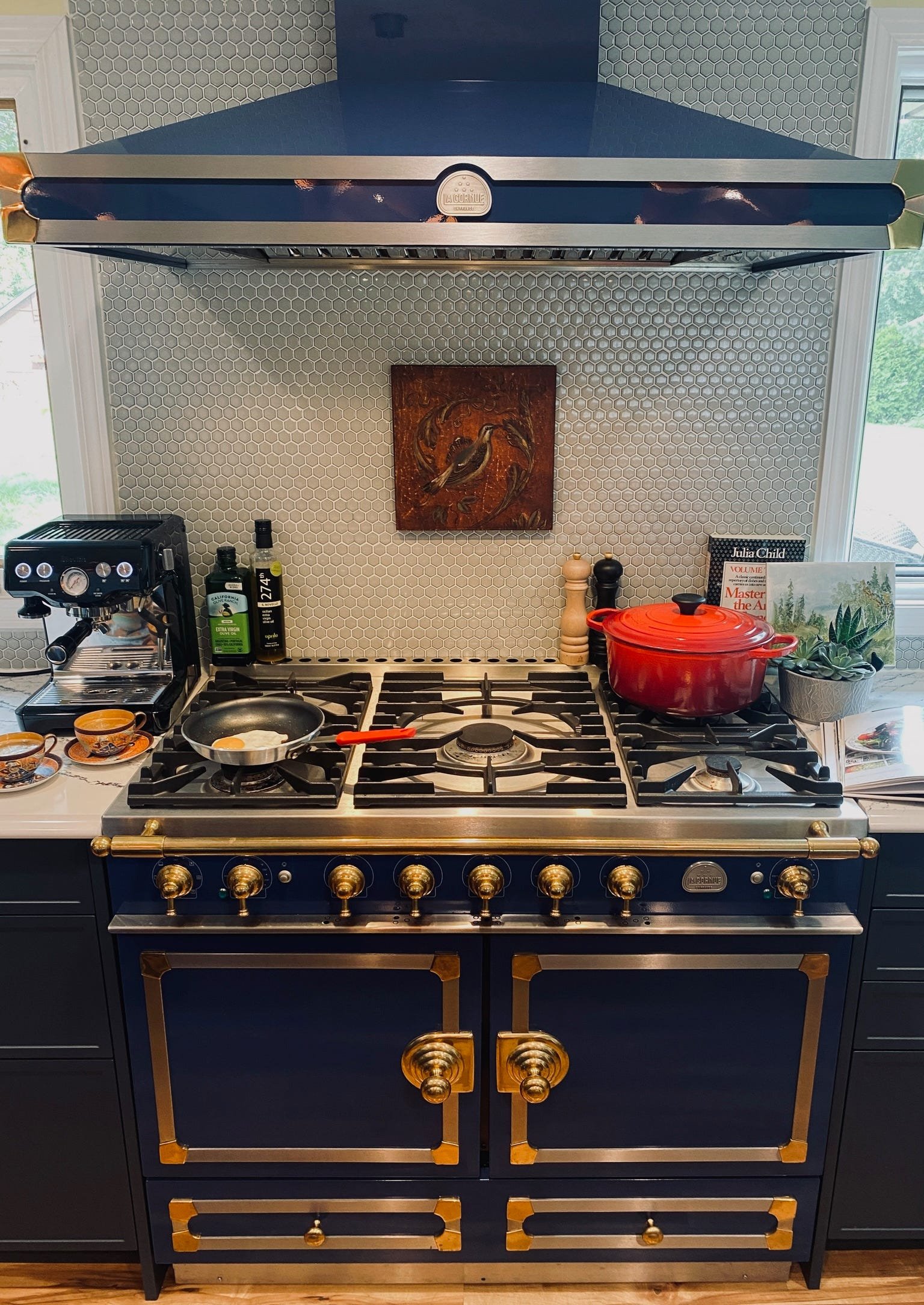
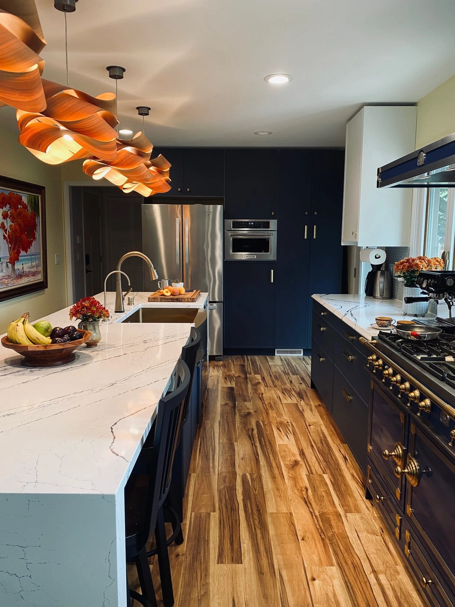
The La Cornue range in my kitchen is a perfect example. It’s a design win on its own. The space doesn’t need anything else shouting for attention. So the lighting is simpler, and the hardware matches without competing.
Why It Matters
For me, “maximalism without madness” means you get the richness of color, the joy of pattern, and the delight of visual texture, but in a way that feels livable. You can walk into the space and feel energized, not assaulted. You notice the details instead of feeling overwhelmed.
So the next time you’re pulling together a room and it starts to feel like a Jackson Pollock painting in 3D, remember:
Give your patterns space.
Let your colors have a hierarchy.
And don’t be afraid to edit.
Because if maximalism is a party, I want mine to be the kind where you leave saying, “That was fabulous,” not “I need to rethink my life choices.”